Back
Hive & Jive
Hive & Jive

A Bee-Free Honey Alternative.
A Bee-Free Honey Alternative.
Challenges and goals
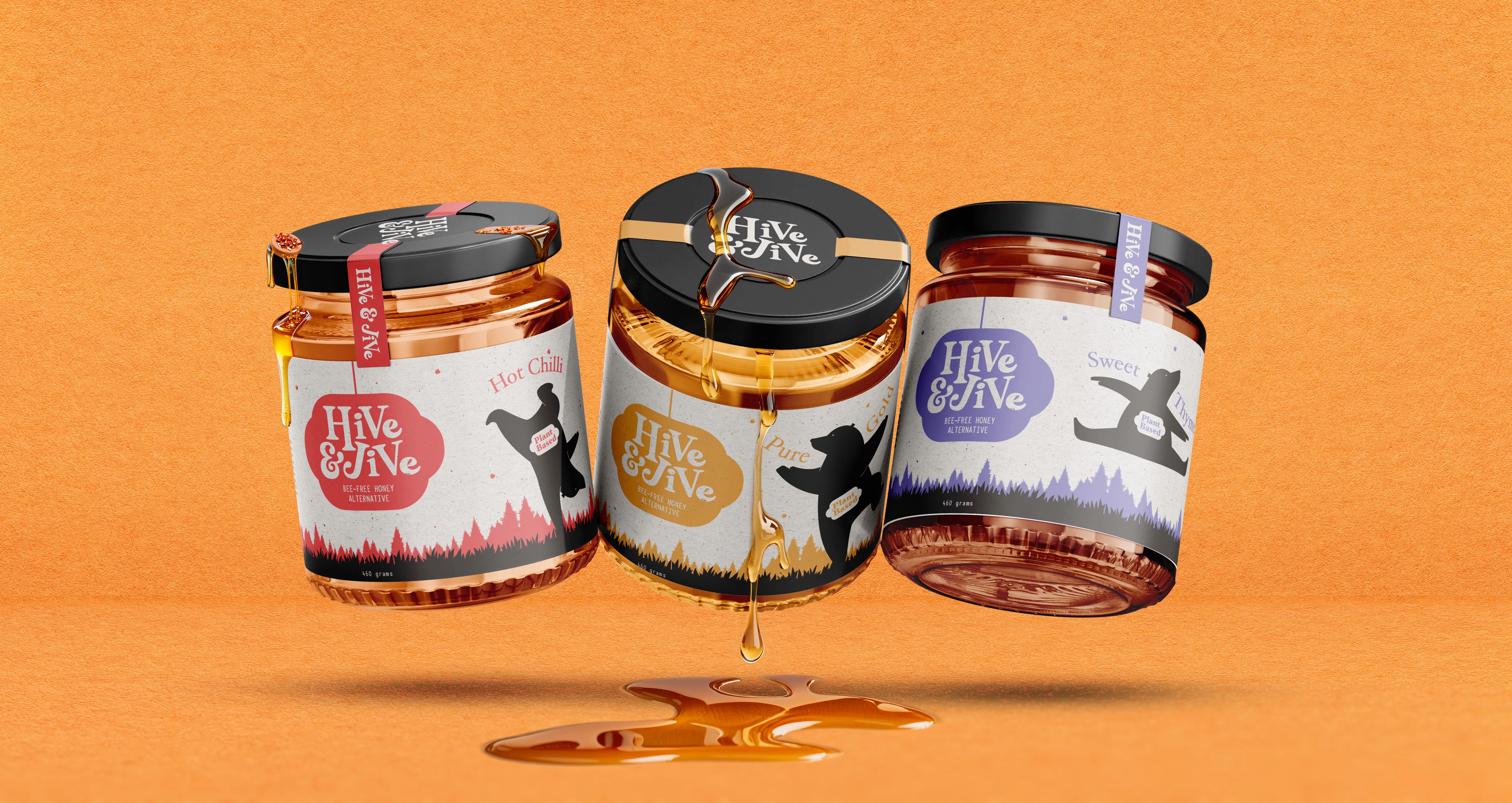
Hive & Jive is a passion project created to see how a single, bold concept can drive an entire brand identity. The goal was to take a sustainable, bee-free honey alternative and completely skip the boring, clinical "health food" tropes. The challenge was to position a plant-based product as something fun, high-energy, and full of flavor, proving that clean alternatives can stand out on the shelf without sacrificing personality.
The Outcome
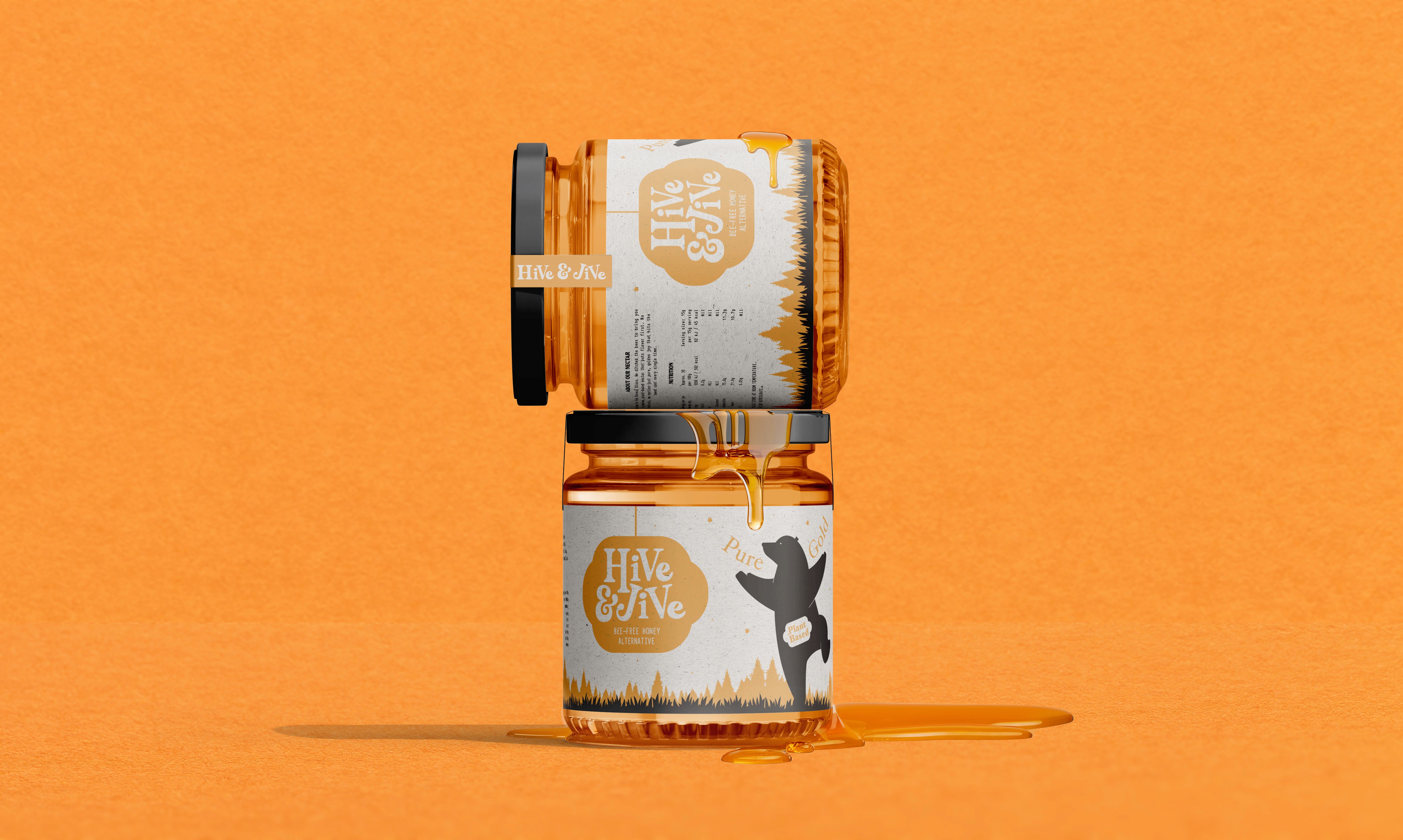
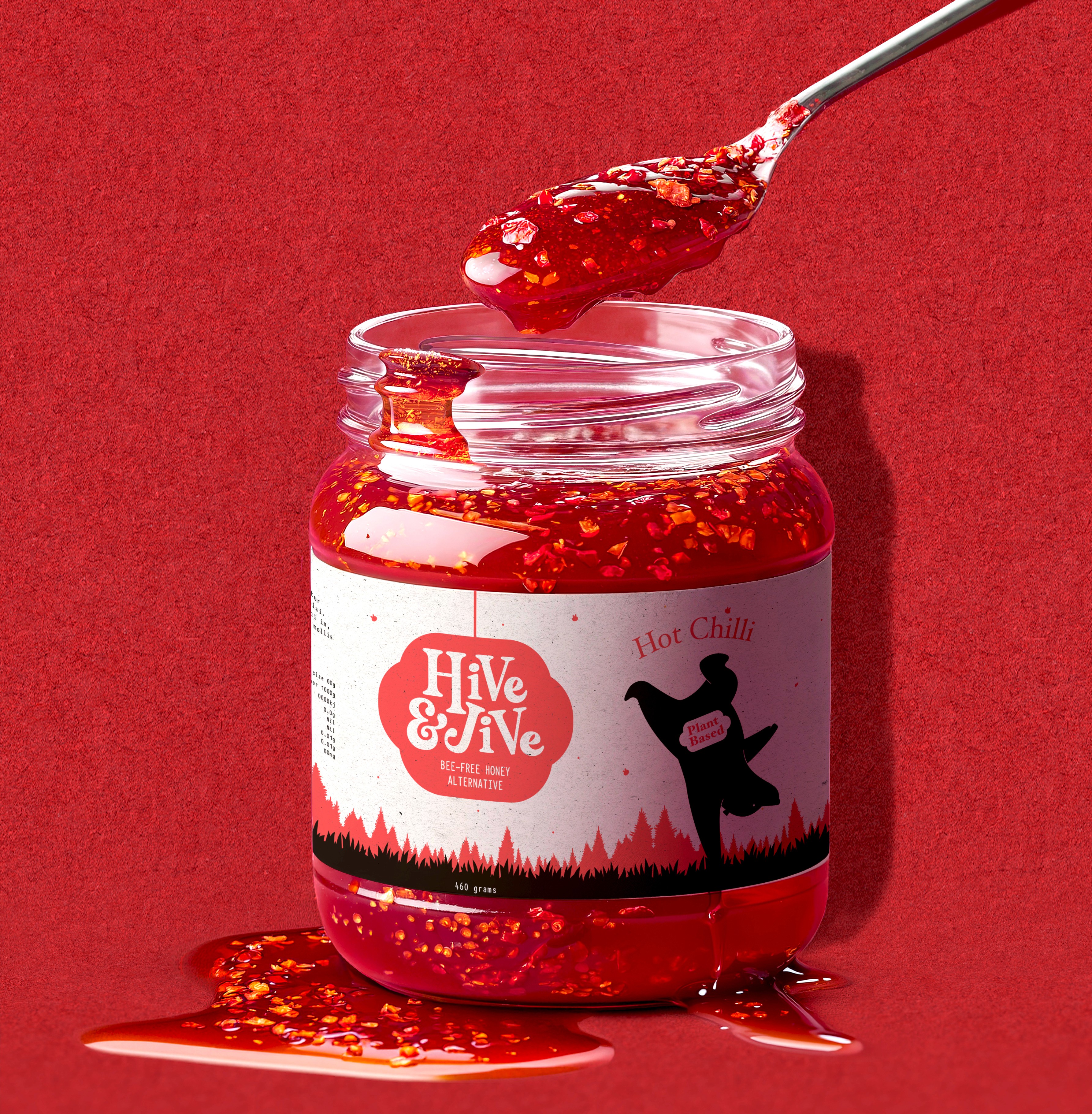
Every visual element ties directly back to a single theme: a high-energy botanical party. The logo blends the organic flow of a honey drip with the shape of a hanging disco ball, signaling clean ingredients and a playful brand voice.
To keep the layout clean and visually balanced, the arched flavor typography uses exact character symmetry to wrap perfectly around the dancing bear silhouettes. The color palette—rich amber, chili red, and herbal violet—creates a strong emotional connection with the consumer and guarantees massive presence on the shelf.
Deliverables
Creative Direction
Logo Suite
Colour Palette
Font Selection
Brand Imagery
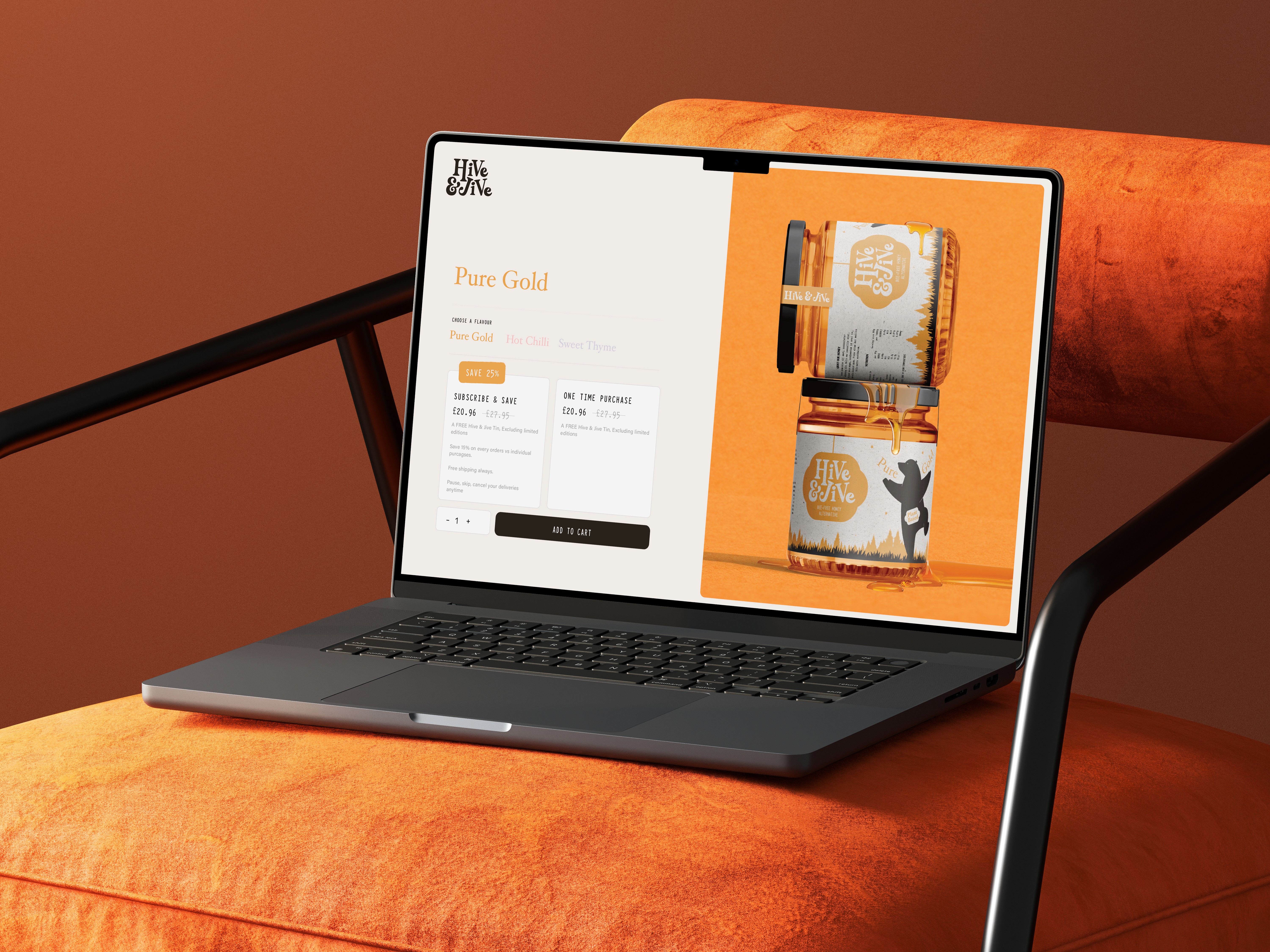
Jar Packaging (x3 flavours)
3D Visualisations
Brand Guidelines
Challenges and goals
Hive & Jive is a passion project created to see how a single, bold concept can drive an entire brand identity. The goal was to take a sustainable, bee-free honey alternative and completely skip the boring, clinical "health food" tropes. The challenge was to position a plant-based product as something fun, high-energy, and full of flavor, proving that clean alternatives can stand out on the shelf without sacrificing personality.
The Outcome
Every visual element ties directly back to a single theme: a high-energy botanical party. The logo blends the organic flow of a honey drip with the shape of a hanging disco ball, signaling clean ingredients and a playful brand voice.
To keep the layout clean and visually balanced, the arched flavor typography uses exact character symmetry to wrap perfectly around the dancing bear silhouettes. The color palette—rich amber, chili red, and herbal violet—creates a strong emotional connection with the consumer and guarantees massive presence on the shelf.
Deliverables
Creative Direction
Logo Suite
Colour Palette
Font Selection
Brand Imagery
Jar Packaging (x3 flavours)
3D Visualisations
Brand Guidelines